MOBILE READY WEB DESIGN - WHY?
Why should your website be mobile ready? Because those visiting your site need it to be.
What web-enabled 'device' are you using to view this website - a desktop PC or a laptop perhaps? Statistically speaking, at least 50% of you are viewing it using a touch-based mobile device such as a Smartphone or Tablet. And that percentage is only set to increase, making desktop and laptop users a minority when it comes to those visiting any website.
Evidence from Research

Research by Google, that even now is over a year old (Feb 2012), shows a massive increase in Smartphone usage, with the UK having the highest increase of all. Similar increases are repeated with Tablet usage. The results of Google's research is reflected in many other surveys.
What is more important to realise though, is that the Smartphone is an 'always on' device, making the Web accessible at all times from virtually anywhere. Smartphone users have their device with them all day, everyday, wherever they go.
Smartphone Owners Can:
- View Your Website
- Complete Your Web Form
- Comment on Your Blog
- Send You an Email
- Telephone You
- Send You a Text Message (SMS)
- Send You a Payment or a Donation
- Access the Web from Anywhere and at Anytime
So would you say these people, using these devices, are less important to you than those using more 'traditional' means to access your website?
Websites designed for Desktop don't work for Mobile users
Websites designed for Desktop and Laptop PCs (90% of websites) do not work well when viewed on Smartphones or many Tablets. Mobile users are constantly having to pinch and zoom in order to read a site's content, whilst navigation links can be impossible to target (touch based devices use fingers to activate links, not a mouse cursor). Overall this makes for a frustrating, unpleasant experience for the mobile user.
Desktop Website viewed on Mobile - an example:
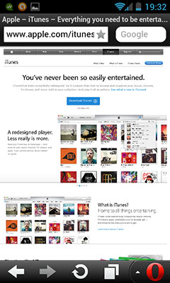
The two screenshots below (Apple's iTunes) show what it is like for someone using a very common Smartphone device (Android OS, with 4 inch screen). Firstly, they get the whole site (designed for a large screen Desktop PC) compressed down in a 2.5 inch space - virtually all text is too small to read, and all link buttons are near impossible to select (to press using fingers).


Of course the Smartphone user can attempt to randomly zoom and hope the device's Web Browser will find a suitable 'column'. But as the screenshot shows (above right) this is a bit hit or miss?


Another example (above) of a website that's not mobile ready - The Spectator. The same problems as before: differcult to read and hard to navigate your way around?
And Now ... A 'MOBILE READY' Website!


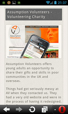
The screenshots above show how a website should be presented to a Smartphone user - everything is either scaled or wrapped so that the user merely needs to swipe (scroll) up or down to access all the site's content. Navigation is easy too, with large finger-sized 'buttons' to press (click).
This makes for a far better 'user experience' for those with mobile devices?
"But what about the Desktop user", we hear you ask - "that layout is going to look strange for them?" But of course the desktop user gets a different layout.

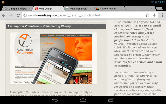
The Desktop user is presented with a wider, two column layout with larger images and longer line lengths. Essentially this website responds to the user, presenting the content differently, depending on what device they are using.
'Mobile-Ready' by Frieze Design
Mobile Ready is a sister website produced by Frieze Design to highlight the importance of having a website that works well on mobile devices. Please contact us if you need help making your website 'mobile ready' or if you have any questions about the topics covered here.
